Form and Manage Groups
The CPS-VO Portal provides extensive support for Special Interest Groups.
Exemplars of types of groups are:
- R&D SIGs
- Federal Agency
- PI Projects
- Websites for workshops and conferences
- Planning meeting groups for workshops and conferences
- Program committee groups for workshops and conferences
- Working groups
Groups may be formed to meet different needs. Typical use cases include:
- Planning R&D Workshops, Meetings, and Conferences
- Birds of a Feather (e.g. technical or policy issues)
- Archival of Proceedings
- Managing Research Projects
- Publicizing Research Results
- Competitions / Challenge Problems
- Open, Educational Resources
The services provided to Groups include:
- Customized Branding with a Configurable Dashboard/Homepage
- Configurable Security Policy
- Calendaring Services
- iCal Support
- Online, Desktop Sharing Meetings
- Meeting Invites
- A Virtual Filesystem (incl. revision control)
- Electronic Discussion Forums
- Wikis
- Group-specific Vocabularies (or 'taxonomies; for labelling documents; incl. associated, domain-specific Search engines)
- Email Broadcasting to Group Membership
- Customized Forms (e.g. a tailored attendee registration page for upcoming conference)
- Inviting Other Potential Members
- Creating Subgroups (i.e. hierarchical families of Groups)
For information on user roles see http://cps-vo.org/tutorial/types-of-users
Configure a Group
After your group form has been approved by site administration, you can go about the process of configuring your group and setting up its pages. The following tutorial section will break down the process for configuring your group settings, branding your group, creating panel pages and adding widgets and custom content to your pages.
Group Settings & Branding
Set the branding and populate content on the home page.
 Video example
 |
|
 |
The rich text editor can be used to set text styles and insert graphics (much like Microsoft Word).
|
 |
|
 |
|
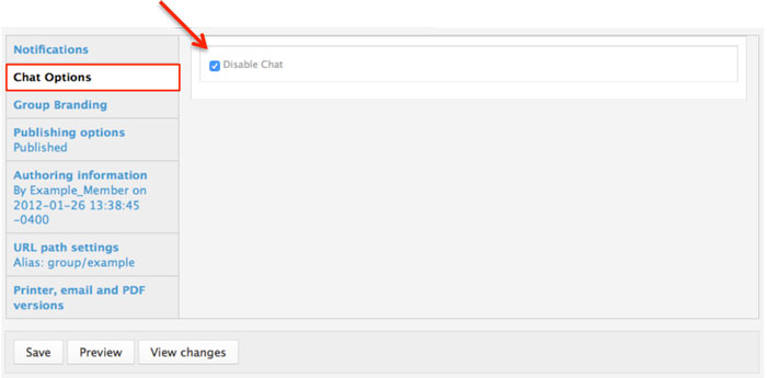
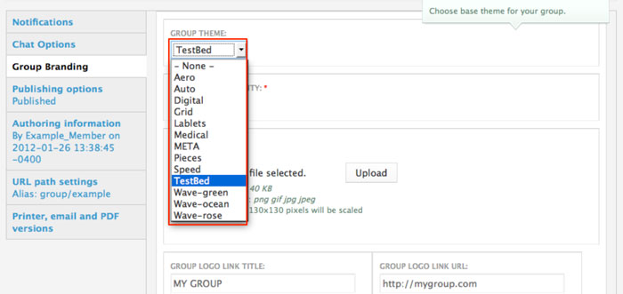
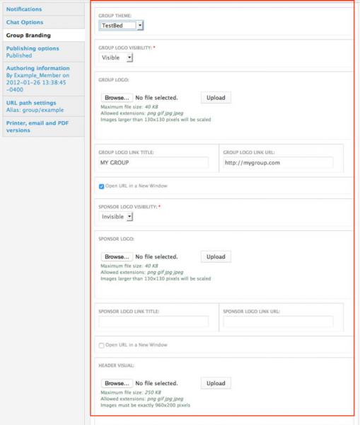
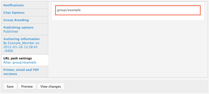
The bottom section of the “Edit Group” panel has a left side menu where you can choose your group chat settings, branding, and set an alias URL path.
 |
|
 |
|
 |
|
 |
|
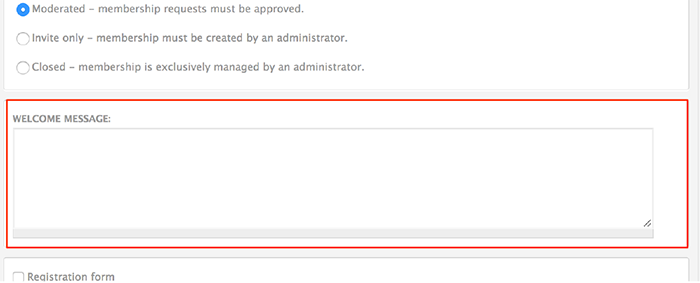
Set a custom welcome message
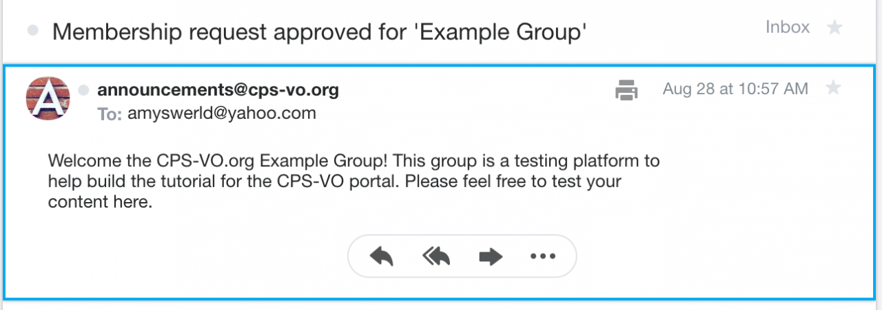
Group Managers may customize the welcome message that is sent to newly approved members. A custom welcome message can help new members know where to start in your group. Note: only moderated groups generate a welcome message.
| Example of the default welcome message: | Example of a custom message: |
 |
 |
P.S. Don't forget to click the save button to save all these settings to your group.
Create a Basic Web Page
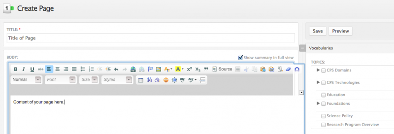
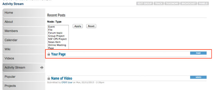
As a manager or moderator of a group you can post web pages which will show up in the activity stream and can be embedded in panel pages of your group.
 Video example
You may later need to reference the node number of your web page for other uses in the portal. The node number of your page is at the top of the browser page in the URL window. If a custom URL was set, you can find the node number by clicking the edit button at the top of your page.

NOTE: Web Pages may only be created/edited by group managers and moderators.
Create Panel Pages
You may want to create panel pages for your group.
Use panel pages to organize your content in an attractive and informative manner. Each panel page becomes a tab when viewing your group. Different layouts can be chosen to best display the content for each panel page.

After you create a panel page you can then "Change the Layout of your Page" and add content.
Content can be added in 2 different ways: "Widgets" or "Custom Content".
Widgets enable you to quickly add automated content. Custom Content provides flexibility to manually add content (e.g. lists, links, descriptions, definitions, etc.)

Change the Layout of your Page
You may want to change the layout of your page.
Add Widgets to Panel Pages
After you have created your panel page and edited the layout, you will want to add content.
 Video example
Widgets can be added to automatically pull in certain kinds content from your group. Search, Calendar, Activity Stream, Member List, etc. are examples of the widgets available. A full list of widgets can be found in the "Widget Reference Table". Content can then be added to different regions of the page via widgets.
 |
Step 1: Content and widgets can be added to your panel page by clicking the "Edit content" link next to the name of your panel page. |
 |
Step 2: You will be taken to a page that shows the regions of your panel page. Click on the gear icon in the upper left corner of a region. |
 |
Step 3: Then select "Add content" from the dropdown menu to add widgets and custom content. |
 |
Step 4: This will take you to a page where you can add widgets and custom content (for more detail see pages adding custom content and "Widget Reference Table". |
 |
A spotlight slideshow is one example of a widget you might want on your panel page.
a. Click "Widgets, group dashboard" in the left side menu. Then select "Spotlight [group]" from the available widgets.
|
 |
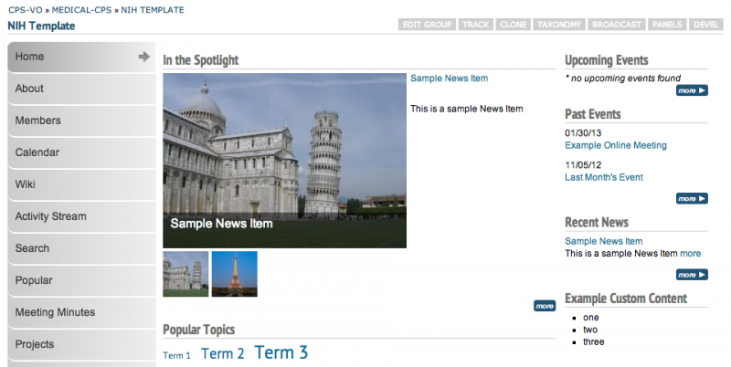
b. Change the Spotlight title if desired, then click "Finish" to set your changes. Group administrators and moderators may now add news and event slides to the spotlight. See "Adding a Spotlight Slideshow". The news and event items will also appear in recent news and upcoming events sections if you have added those widgets to your panel page. Events and news widgets work best when added to the right side of your 2 column layout. See "Widget Reference Table" for a list of widgets and their functions. |
 |
Step 5: After adding widgets, click "Save" to take you back to your panel pages list. |
 |
After adding content to your group you can expect to see something like this Example Home Page |
Add Content to Widgets
Each widget requires certain content which is either automatically populated by activity in your group, or purposely added by the group manager. A "Widgets Reference Table" displays the widgets that are available to add to panel pages. Adding content to those widgets is covered in the section called "Kinds of Pages".
A spotlight slideshow is one example of a widget to which you might want add content.
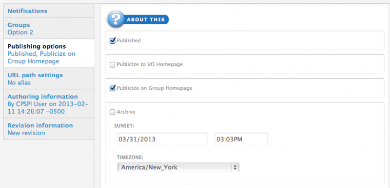
About Publishing Options
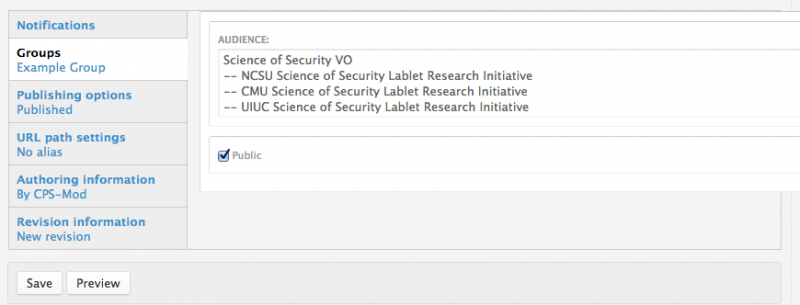
- Publish: Uncheck this option if you don't wish for this content to appear on the VO yet. Useful for saving drafts of content that requires editing before going live/published.
- Publicize on Group Homepage: This option will place your post on your group's homepage in the corresponding section (Recent News, Upcoming Events, etc…)
- Archive: Will remove this post from displaying publicly (or to members of your group) and add it to a historical archive listing. You may also want to type in a date and time in the “Sunset” section to control when your event or news item is automatically archived.
- Display in Slideshow: Will place this post, along with its image (or video), in a slideshow. Must be used with either Publicize to Entire VO or Publicize on Group Homepage options.
- Pin to Top of Lists: This option will make this post appear at the top of content listings, regardless of any other settings. Useful for denoting important content or content that has a "call to action" associated with it.
Widget Reference Table
Widgets fall in different categories for different uses on pages.
- Widgets in the "Organic Groups" category would be used in creating your home or about page.
- Widgets in the "View Panes" category would be used on pages where you want to display recent comments.
- Widgets in the "Group Dashboard" category are typically embedded into one of the regions of a panel page.
- Widgets in the "Group Menu Items" category typically populate an entire page.
Click on links in the left column of the table below to see an example of the widget dashboard.
Click on links in the right column of the table below to see examples of those widgets being used on pages.
| Widget Categories |
Widgets within Category |
| Organic Groups | |
| View Panes | |
| Widgets, group dashboard | |
| Widgets, group menu items |
Add Custom Content
Custom content can be added to panel pages either by referencing an existing node (preferred method), or by creating content within a region on the page.
 |
Step 1: Click the "Edit content" link next to the name of your panel page. |
 |
Step 2: You will be taken to a page that shows the regions of your panel page. Click on the gear icon in the upper left corner of a region. |
 |
Step 3: Then select "Add content" from the dropdown menu. |
 |
Step 4: This will take you to a page where you can add widgets and custom content. |
 |
New custom content: Clicking the “New custom content” link will take you directly to an editor where you can type in the content you desire to shown in the widget. |
 |
Existing node (preferred method): To reference an existing node, you will need to type the number of the node in the first text field. The number of the node can be found in the URL of the page you want to add. If a custom URL has been set, you can find the node number by clicking the "edit" button on the page (For more information see "Creating a Web Page"). There are options to override the title of the node, leave existing node title, link the node title to the full node, allow comments and 'read more' links and tell whether to show the entire node or just a teaser (build mode). |
 |
Don’t forget to click the “Finish” button when you’re done typing.
|
Edit content that has already been created
Existing node: simply click the "edit node" link that shows when you hover over the content on the page.
Custom embedded content: navigate to "Panels" and edit the page where the content is placed. Click the gear icon and select "edit".
Edit Embedded Custom Content
You may need to edit content after adding existing nodes and custom content into a panel page.
 Video example
 |
To edit existing nodes embedded into the panel page (see ”add custom content”) hover your mouse at the top left of the content.
An “Edit node” link will appear only if you are group administrator, manager, moderator. Click on “Edit Node” to launch the text editor and edit the content.
|
 |
Click "Save" when you are finished editing and you will be taken back to the panel page where the node was embedded. |
 Video example
Kinds of Panel Pages
Different layouts can be chosen to best display the content for each custom page. Content can then be added to different regions of the page via widgets.
Creating a Home Page
Creating a basic custom home page versus creating a dashboard style home page.
Creating a Basic Home Page
After editing your group settings your home page will have a left menu with 3 tabs: Home, Forums, and Files.
 Video example
The content area of your home page will include the mission statement and an activity stream (a dynamic listing of content as it is added to the group). Many times groups do not want the activity stream on their home page. In order to remove it you will need to set up a custom home page.
Once you have created the new home page you can customize the content.
Creating a Dashboard-Style Home Page
After creating a basic home page for your group, you may want to change the layout to accommodate more features.
View a video example for creating a Dashboard Home Page
 Video example
For instructions on how to add widgets and custom content to your dashboard-style home page see page adding widgets to your panel page and adding "custom" content page. Adding slides to your slideshow widget is covered in the next tutoral section "Adding a Spotlight Slideshow". See the widget reference table for further description of available widgets.
View a video example for adding news, events and spotlight slideshow widgets to your Dashboard Home Page
 Video example
Adding A Spotlight Slideshow
You might want to add a slideshow to your home page.
 Video example
 |
You will first need to add the Spotlight widget. Click the "Edit content" link. |
 |
You will be taken to a page that shows the regions of your panel page. Click on the gear icon in the upper left corner of a region. |
 |
Then select "Add content" from the dropdown menu. |
 |
This will take you to a page where you can add widgets and custom content (for more detail see pages adding custom content and Widgets Table).
Click "Widgets, group dashboard" in the left side menu. Then select "Spotlight [group]" from the available widgets.
|
 |
Change the Spotlight title if desired, then click "Finish" to set your changes. |
 |
Step 5: After adding widgets, click "Save" to take you back to your panel pages list. |
Adding Content to the Spotlight Slideshow
Only group Managers, Moderators, and Members who have been granted the 'Trusted User' status have permissions to add content to the group spotlight slideshow.
 |
After creating an “Event” or “News item", scroll down to the area that is titled “Slideshow Image”. Click the “Choose File” button to retrieve an image from your computer. Click the “Upload” button to upload the image. |
 |
If your upload is successful, the image will display next to a button giving you the option to “Remove” it.
|
How to add content to your spotlight slideshow (usually found on the group home page).
 |
If you want the slideshow image and title to link to something other than the node URL (default), enter a custom "slideshow link" to make the spotlight link to a custom page with the setting below. Checkmark "Open URL in a New Window" if you want the browser to launch a new window upon click. If it's an external link, it needs to be a fully qualified URL, ie. http://www.somesite.com If it's internal, it should be sufficient to put a relative URL, ie. node/1234. |
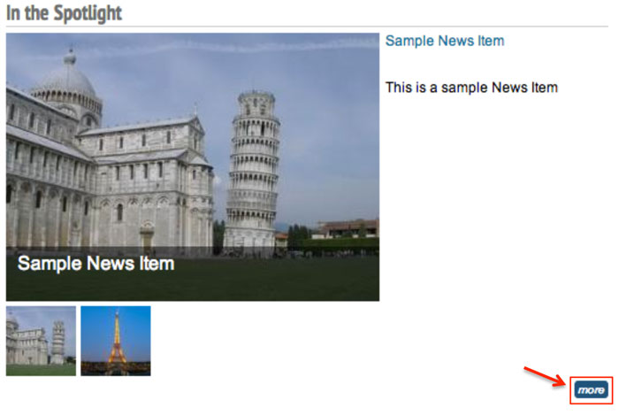 |
There is also a "more" button at the bottom right of the slideshow that links directly to the CPS-VO news item or event rather than the custom link. |
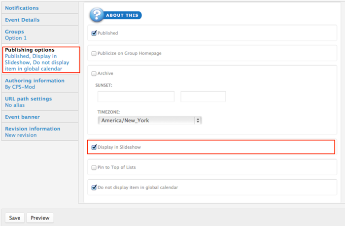 |
Next, click on the gray tab titled “Publishing options” and checkmark the box next to “Display in Slideshow”. Click "Save" to publish your event and show it in the spotlight. |
About Publishing Options
- Publish: Uncheck this option if you don't wish for this content to appear on the VO yet. Useful for saving drafts of content that requires editing before going live/published.
- Publicize on Group Homepage: This option will place your post on your group's homepage in the corresponding section (Recent News, Upcoming Events, etc…)
- Archive: Will remove this post from displaying publicly (or to members of your group) and add it to a historical archive listing. You may also want to type in a date and time in the “Sunset” section to control when your event or news item is automatically archived.
- Display in Slideshow: Will place this post, along with its image (or video), in a slideshow. Must be used with either Publicize to Entire VO or Publicize on Group Homepage options.
- Pin to Top of Lists: This option will make this post appear at the top of content listings, regardless of any other settings. Useful for denoting important content or content that has a "call to action" associated with it.
After adding content to your slide show you can expect to see something like the example below.
Creating a Projects Page
Creating a projects page is a convenient way to post your group research projects in one easily accessible location.
 Video example
First create a "Projects" Page by adding a new page in Panels. (see Creating Custom Pages for additional instructions).
 |
When your page is set up and named, click the "Edit content" link to the right of the title of your "Projects" panel page. |
 |
You will be taken to a page that shows the regions of your panel page. Click on the gear icon in the upper left corner of a region. The "Project" widget works best if placed in the Top or Bottom region of your panel page display settings due to its horizontal layout. |
 |
Select "Add content" from the dropdown menu. |
 |
This will take you to a page where you can add widgets and custom content. There are 3 widgets associated with Group Projects content.
Click the "Research Projects, All [group], Research Projects, Archived [group], or Research Projects, Current [group]" widget link - which is found under the left menu item called “Widgets, group menu-items”. This will insert the widget into the chosen panel-page region (top or bottom). |
 |
A new page will launch with a "Finish" button. Click the "Finish" button to insert the widget. Only one widget at a time may be added using this process. Click the "Save" button at the bottom of your panel regions page to set your changes.
|
 |
Initially the "Projects" page will read "no projects found". |
 |
Linked project titles will display on the "Projects" page in a table as group members add projects (Further instructions to members about contributing projects can be found in this tutorial at Creating a Group Project). |
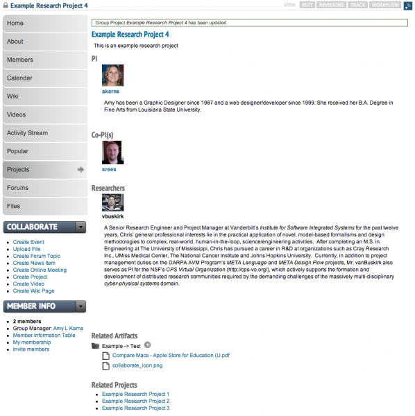
Clicking on the linked project title will lead to the individual project page (which will appear as below).
Creating an About Page
Creating an "About" page is a way to provide a brief overview of your group.
 |
When you initially created your group, you added your group “Description” and a “Mission statement”. This content can be included in your “About” page by using widgets. |
 |
First create an "About" Page by adding a new page in Panels. (see Creating Custom Pages for additional instructions).
When your page is set up and named, click the "Edit content" link to the right of the "About" panel page title. |
 |
You will be taken to a page that shows the regions of your panel page. Click on the gear icon in the upper left corner of the region in which you want your content to appear. |
 |
Select "Add content" from the dropdown menu to add widgets and custom content. |
 |
Click either the "OG description" or "OG Mission" link to add the desired content to your page and click “Finish”. |
 |
You may also add new custom content or content from an existing node to your "about" page by following the “Add Custom Content” instructions.
Click on the widget name to insert that widget. A new page will launch with a "Finish" button. Click the "Finish" button to insert the widget. Only one widget at a time may be added using this process.
After both widgets are added, click the "Save" button at the bottom of your panel regions page to set your changes.
|
 |
Your description and mission statement will now show on your "About" page. |
Creating a Members Page
A "Members" page is a convenient alphabetical listing of all members in a group with easy access to features such as adding to contacts, viewing contributions, linking to profile, etc.
 |
First create a "Members" Page by adding a new page in Panels. (see Creating Custom Pages for additional instructions). When your page is set up and named, click the "Edit content" link to the right of the title of your "Members" panel page. |
 |
You will be taken to a page that shows the regions of your panel page. Click on the gear icon in the upper left corner of the full-width region where you want your members list to display. The top or bottom region is best for this widget. |
 |
Select "Add content" from the dropdown menu. |
 |
This will take you to a page where you can add widgets and custom content.
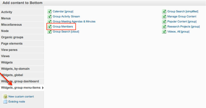
The “Group Members” widget can be found by selecting the left menu item “Widgets, group menu items”.
|
 |
Click on the widget name to insert that widget. A new page will launch with a "Finish" button. Click the "Finish" button to insert the widget. Only one widget at a time may be added using this process.
Click the "Save" button at the bottom of your panel regions page to set your changes.
|
 |
Example of a "Members" directory page.. |
Creating a Calendar Page
A "Calendar" page is a convenient place to post a group event calendar.
 |
First create a "Calendar" Page by adding a new page in Panels. (see Creating Custom Pages for additional instructions). When your page is set up and named, click the "Edit content" link to the right of the title of your "Calendar" panel page. |
 |
You will be taken to a page that shows the regions of your panel page. Click on the gear icon in the upper left corner of the region in which you want your search widget to display. |
 |
Select "Add content" from the dropdown menu. |
 |
This will take you to a page where you can add widgets and custom content.
The “Calendar [group]” widget can be found by selecting the left menu item “Widgets, group menu items”.
Add the widget by clicking on its title.
|
 |
Click on the widget name to insert that widget. A new page will launch with a "Finish" button. Click the "Finish" button to insert the widget. Only one widget at a time may be added using this process.
Click the "Save" button at the bottom of your panel regions page to set your changes.
|
 |
A calendar will then be added to your "Calendar" page. |


Creating an Activity Stream Page
The content area of a basic home page will include the mission statement and an "activity stream" (a dynamic listing of content as it is added to the group). Many times groups do not want the activity stream on their home page. In order to remove it you will need to set up a custom dashboard style home page.
Creating an"Activity Stream" page is encouraged if you remove the activity stream.
Follow the directions below to create an "Activity Stream" page.
 |
First create an "Activity Stream" Page by adding a new page in Panels. (see Creating Custom Pages) for additional instructions). |
 |
You will be taken to a page that shows the regions of your panel page. Click on the gear icon in the upper left corner of the region in which you want your content to appear. |
 |
Select "Add content" from the dropdown menu to add widgets and custom content. |
 |
The “Group Activity Steam” widget can be found by selecting the left menu item “Widgets, group menu items”.
|
 |
The "Recent Comments" widget is found in the “View Panes” category in the left menu. |
 |
Click on the widget name to insert that widget. A new page will launch with a "Finish" button. Click the "Finish" button to insert the widget. Only one widget at a time may be added using this process.
Click the "Save" button at the bottom of your panel regions page to set your changes.
|
 |
When activity and comments begin to populate in your group, you can expect it to look like the image on the left. Notice the option of filtering recent posts by type. |
Creating a Wiki
Managers can create Wikis for their group where they and their group members will be able to add and edit shared pages (see "Creating a Wiki Page")
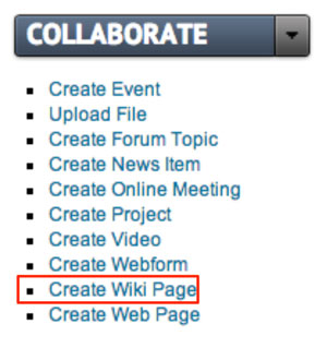 |
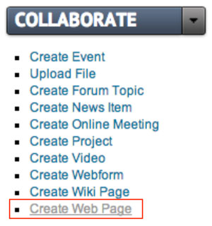
Make sure you have already created your first wiki page before you add the wiki widget to your group. If not, you can use the "Collaborate" toggle menu to get started. Click "Create Wiki Page" to launch the rich text editor. |
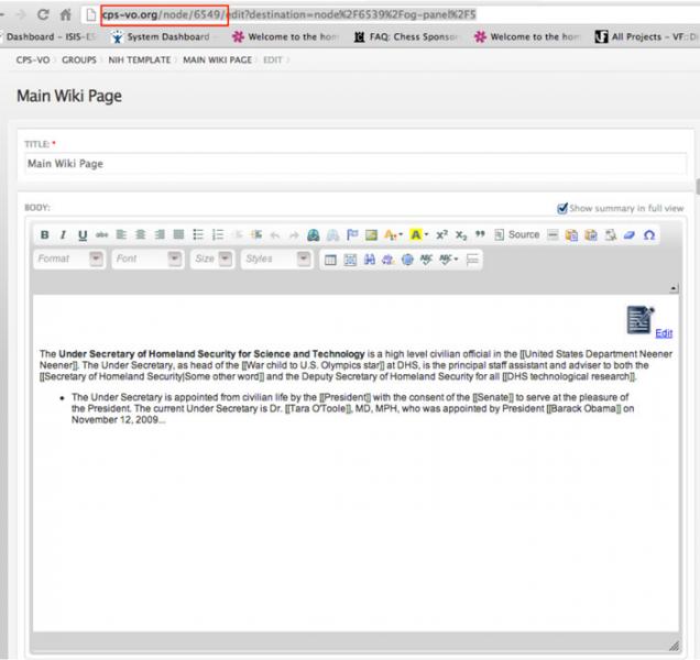 |
You can then find the node ID number in the top address bar. |
 |
After you create your first wiki page, create a panel page and name it "Wiki" (see “Creating Custom Pages”). Click “Edit content” link to the right of the title of your "Wiki" panel page. |
 |
You will be taken to a page that shows the regions of your panel page. Click on the gear icon in the upper left corner of the full-width region in which you want your wiki to display. The "Wiki" widget works best if placed in the Top or Bottom region of your panel page display settings due to its horizontal layout. |
 |
Select "Add content" from the dropdown menu. |
 |
This will take you to a page where you can add widgets and custom content. Click the "Existing node" link in the bottom left menu to begin. |
 |
This will launch a form. Type the node ID number of your first wiki page in the first text field. |
 |
Don’t forget to click the “Finish” button when you’re done typing. |
 |
Click the "Save" button at the bottom of your panel regions page to set your changes. |
 |
Your first wiki page will now be displayed on your "Wiki" panel page. Group members can now add and edit shared pages (see "Creating a WIki Page"). |
Creating a Popular Content Page
A popular content page is helpful for perusing the most viewed and used group content.
 |
First create a "Popular Content" Page by adding a new page in Panels. (see Creating Custom Pages for additional instructions). When your page is set up and named, click the "Edit content" link to the right of the title of your "Popular Content" panel page. |
 |
You will be taken to a page that shows the regions of your panel page. Click on the gear icon in the upper left corner of the region in which you want your search widget to display.
|
 |
Select "Add content" from the dropdown menu. |
 |
This will take you to a page where you can add widgets and custom content.
Click to add the “Popular Content (group)” widget (which can be found by selecting the left menu item “Widgets, group menu items”).
|
 |
A new page will launch with a "Finish" button. Click the "Finish" button to insert the widget. Only one widget at a time may be added.
Click the "Save" button at the bottom of your panel regions page to set your changes.
|
 |
As content is developed in your group, a table will display on the page like the example below. |
Creating a Videos Page
A "Videos" page is a convenient way to provide a place for group members to share embedded videos from services such as TED, Vimeo, or YouTube.
 |
First create a "Videos" Page by adding a new page in Panels. (see Creating Custom Pages for additional instructions). When your page is set up and named, click the "Edit content" link to the right of the title of your "Videos" panel page. |
 |
You will be taken to a page that shows the regions of your panel page. Click on the gear icon in the upper left corner of the region in which you want your search widget to display. |
 |
Select "Add content" from the dropdown menu. |
 |
This will take you to a page where you can add widgets and custom content.
Click on the “Videos, All [group]” widget (which can be found by selecting the left menu item “Widgets, group menu items”).
|
 |
The "Video, Featured [group] widget" is found in the “Widgets, group dashboard” category in the left menu. A video must be set to "public" in the group settings and in the publishing options as "published" and "publicized to group home page" in order to show up in the featured videos category. (see bottom of page for more about featuring a video). |
 |
Click on the widget name to insert that widget. A new page will launch with a "Finish" button. Click the "Finish" button to insert the widget. Only one widget at a time may be added using this process.
Click the "Save" button at the bottom of your panel regions page to set your changes.
|
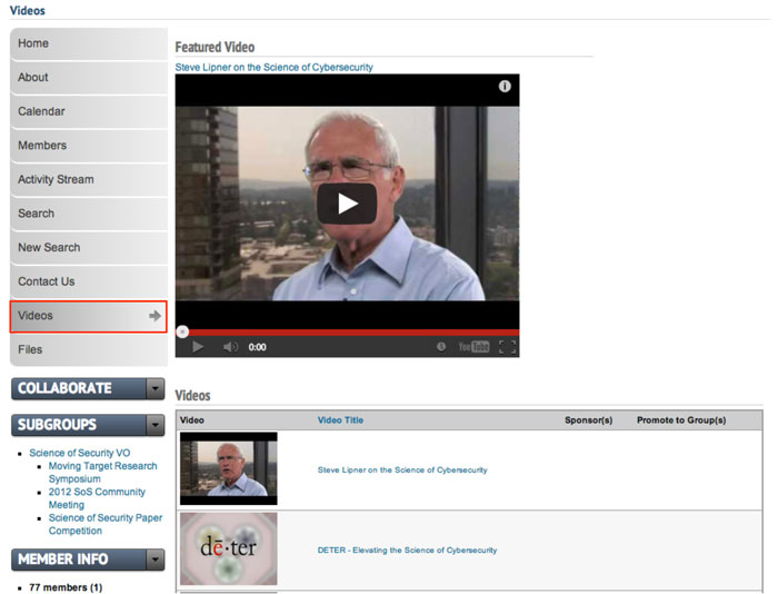 |
You and group members can now begin adding videos to your "Video(s)" page (see "Creating A Video"). You can expect the video page to look similar to the example below. |
More About Featured Videos
Creating a Moderation Board Page
A Moderators Board page is helpful for editing, deleting and moving group content.
 |
First create a "Modboard"* Page by adding a new page by that name in Panels. (see Creating Custom Pages for additional instructions). When your page is set up and named, click the "Edit content" link to the right of the title of your "Modboard" panel page. *Some groups choose to name this page differently, but the standard CPS-VO terminology is "Modboard". |
 |
You will be taken to a page that shows the regions of your panel page. Click on the gear icon in the upper left corner of the region in which you want your search widget to display. |
 |
Select "Add content" from the dropdown menu. |
 |
This will take you to a page where you can add widgets and custom content.
Click to add the “Manage Group Content” widget (which can be found by selecting the left menu item “Widgets, group menu items”).
|
 |
A new page will launch with a "Finish" button. Click the "Finish" button to insert the widget. Only one widget at a time may be added.
Click the "Save" button at the bottom of your panel regions page to set your changes.
|
 |
As content is developed in your group, a table will display on the page like the example below. A set of dropdown menus give you bulk-editing capabilities. |
Creating an Agenda and Meeting Minutes Page
An "Agenda and Meeting Minutes Page" page is a convenient way to store and search meeting documentation.
 |
An "Agenda and Meeting Minutes" page collects and displays anything tagged with 'Meeting Minutes' or 'Agenda' from the 'Document Type' taxonomy (located to the right of the text editor when creating group content). |
 |
First create a "Meeting Minutes" Page by adding a new page in Panels. (see Creating Custom Pages for additional instructions). When your page is set up and named, click the "Edit content" link to the right of the title of your "Meeting Minutes" panel page. |
 |
You will be taken to a page that shows the regions of your panel page. Click on the gear icon in the upper left corner of the region in which you want your search widget to display. |
 |
Select "Add content" from the dropdown menu. |
 |
This will take you to a page where you can add widgets and custom content.
Click on the “Videos, All [group]” widget (which can be found by selecting the left menu item “Widgets, group menu items”). The "Group Meeting Agendas & Minutes widget" is found in the “Widgets, group dashboard” category in the left menu. Click on the widget name to insert that widget. A new page will launch with a "Finish" button. Click the "Finish" button to insert the widget. Only one widget at a time may be added using this process.
Click the "Save" button at the bottom of your panel regions page to set your changes.
|
Initially your Meeting Minutes page will be empty. However, the search features will automatically populate as content is added and tagged with 'Meeting Minutes' or 'Agenda' taxonomies from the 'Document Type' taxonomy (located to the right of the text editor when creating group content).
Manage a Group
The CPS-VO Portal provides extensive support for Special Interest Groups. Group Managers and Group Moderators are responsible for maintaining and grooming the content in their group. To edit group content select the [Edit] menu tab in the upper righthand corner of the page. To remove content select the [Edit] menu tab in the upper righthand corner of the page and then the [Delete] button located next to 'Save' and 'Preview'.
The links below explain how to perform advanced group management functions.
Administer Members
Handling memberships in a group involves overseeing who is a member of the group, and who are the administrators, managers and moderators. There must be at least one administrator for every group. Members of a group may leave the group at any time. As the administrator you may only leave the group if at least one other administrator is designated.
 |
View Member Information Table Click on the "Membership Information Table" link in the "Member Info" toggle menu beneath your group menu in the left sidebar. |
 |
This will take you to a "member list" where administrators and managers can moderate group membership requests and edit user group privileges.
Clicking the orange "CSV" button at the bottom left of the table will export the list in spreadsheet format. |
 |
View Group Members To view a page with the photos and names of the members of your group, click the "Faces" tab. |
 |
Add Members Managers can add members to a group and configure their function in the group. Click on the “Add Members” tab. Type one or more usernames into the “List of Users” text area. Separate multiple usernames by commas or new lines. Click the “Add users” button to complete the process.
If you need to find a user, enter their name in the upper right hand search field (see Seeking Out Colleagues). Click the individual's name to go to their profile page where you will find their username listed beneath their real name.
|
 |
Configure member roles from the "Configure roles" tab. Members can be given "manager" or "moderator" roles from this page by checkbox selection. Click the "Save" button to submit changes. |
 |
Invite Members Group members can invite users to join the group by using the "Invite members" tab. This will send an email message asking the invitee to click a link to join your group. Type one or more comma delimited email addresses and/or VO usernames into the "Invitees" text input area, provide an optional message in the textbox entitled "Additional message". Finally, click the "Invite" button to send the message(s). Note, a maximum of 20 invites can be sent out at a time. |
Send Out Messages
Only group managers can broadcast a message to members of a group. A broadcast emails all group members with a copy of the message. Remember your message will be read by all of your group members. The "From" field of the message upon delivery will say it is from "cps-vo on behalf of" and your name from your profile.
To broadcast a message, follow these steps:
Set Up Group Vocabularies/Terms & File Folders
Content should be labeled to make it searchable. See http://cps-vo.org/node/878 for an explanation of Tags, Terms and Labels.
As a group administrator you can edit and create taxonomies for your group with the following steps.
 Video example
* NOTE: Details for further customizing your group are given in Configuring Groups.
Create a Webform
Webforms may only be created/edited by group managers and moderators.
As a manager or moderator of a group you can post web which will show up in the activity stream and can then be embedded in panel pages of your group.
Create Webform and add components
 Video example
Types of Components:
- Date: Inserts a drop-down menu for user to select a month/day/year. Optional calendar selector is also available.
- Email: A field where user can enter their email address
- Fieldset: A boxed field that contains a description and a title
- File: A place where user can upload a file.

*NOTE: Create a custom directory by typing a path similar to the one below. This identifies attachments with the webform. - Grid: a series of questions and options with radio button selectors
- Hidden: This gives you the option to insert variables or notes which users cannot see.
- Markup: This allows webform creator to enter text in multiple colors and font styles.
- Textfield: You can collect lengthier responses from your users by creating "textarea" fields
- Number: Creates either a dropdown menu or a text area with predetermined low and high integers.
- Page break: Allows you to split your webform into 2 pages.
- Select Options: Makes a list of options with radio buttons.
- Textarea: You can collect lengthier responses from your users by creating "textarea" fields
- Textfield: A one line field for user to enter text.
- Time: A dropdown hr/minut/am/pm selector

Configuring Notification Emails
 Video example
- The first is the email address (or multiple addresses) of the webform administrators.
- The second will be the submitter's email address as they typed it in the "email" field on the webform.
*NOTE: You must include at least one email component field in the webform to enable this function.
Configuring Form Settings
 Video example
The "Form Settings" tab will take you to a page where you can choose a landing page, set submission limits, and choose access policies.
Submission Settings
Landing page option with confirmation message
The webform user will be taken to a landing page after submitting the form. You may choose (three options shown in image below) where the user is redirected.
- Confirmation Page - Sends user to generic CPS-VO.org confirmation page.
- Custom URL - Redirects the user to a custom page (most usually the group home page)
- No Redirect - Reloads current page.

Submissions Limit
Submission Access
 |
Select which user roles are able to view and submit the form. Note: Only authenticated users (CPS-VO members) are able to edit their submissions. |
Configuring Form Validation and Access Policies
- Specific value(s)
- Verifies that the specified component contains a defined value (select, textfield, textarea, email, hidden, select)
This feature would be used (for example) when a code is required to submit the form. The webform can then be viewable by anonymous users, but can only be submitted by users who have the code.
Export the Webform
 |
Clicking the export button will prompt a download of the PHP code generated to create the form. |
Access Webform Results
 |
|
View/Edit Individual Submissions
It's easiest to access individual results from the "table" view. Click on the submission number on the far left of the column. That will take you to their individual submission where you can edit the submissions if needed.
 |
|
 |
This will take you to a window where you can view and edit the individual submission. |
Edit the Webform

Webform Check List
![]() Does your webform have a description?
Does your webform have a description?
![]() Is your webform published?
Is your webform published?
![]() Is your webform public or is it private to your group?
Is your webform public or is it private to your group?
![]() Have you created all the components you need?
Have you created all the components you need?
![]()
Are the necessary components set as mandatory?
![]()
Have you configured notification emails to go to the user and also to the form administrator?
![]() Have you configured the confirmation landing page?
Have you configured the confirmation landing page?
![]() Have you configured the submission access rules?
Have you configured the submission access rules?
![]() Does your webform need an access code? Has one been configured?
Does your webform need an access code? Has one been configured?
![]()
Have the necessary users been granted permissions to view the webform results?
Manage Group Forums
Only group managers have permissions to administer group forums. Managing group forums involves adding new forums, editing or deleting existing forums, controlling the listing order of forums, and adjusting forum privacy settings.
Using the Modboard
see Creating the Modboard Page for additional instructions on how to create the modboard panel page.
 As content is developed in your group, a table will display on the page like the example to the left.
| Node: Type | Node: Title | Node: Body | Public | Published | Promoted to front page | Sticky | Items per page |
 |
 |
 |
|
|
|
|
 |
 |
Type a search word or phrase in text box. |
Type a search word or phrase in text box. |
Apply Applies the search |
Reset Resets the parameters to 0 |
Bulk Operations
|
||
- Click the "Apply" button to set your search parameters.
- Select the nodes you would like to edit by the checkboxes next to the title of the node.
- Choose a Bulk Operation from the Bulk Operations dropdown menu.
- Type a log message
- Check the "disable notifications" box if you want to keep your changes from being broadcast.
- Select the "Execute" button
- Follow the prompts for the operation you chose
- You will be taken back to the modboard page with a confirmation message at the top describing the action (see example below).

Group Manager/Moderator Actions by Role
Group Manager
| Group policies and settings |
| Configure group menu pages |
| Administer group members |
Manage group forums
|
| Create or edit group vocabularies |
| Send a broadcast message |
Group Moderator
| Groom and moderate content |
| Publicize content on the group home page |
| Create and manage webforms |
| Create a basic web page |
